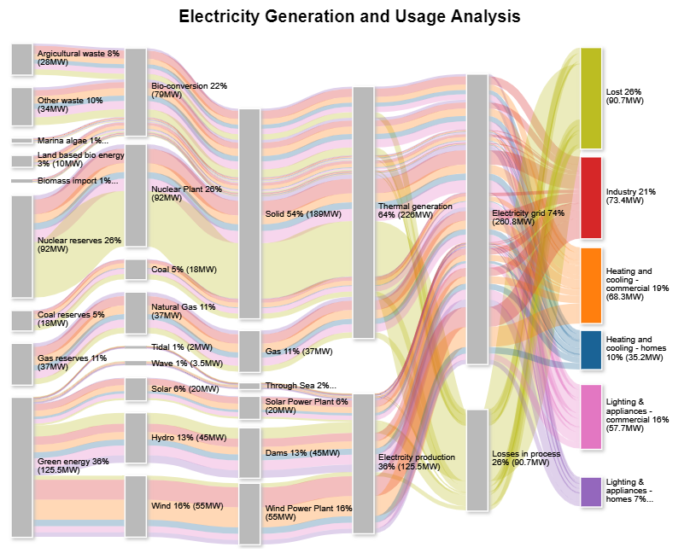
An energy flow diagram is used to visually and quantitatively display energy and energy transformation. Also known as Energy Flow Charts, they show the flow of energy from its primary raw form all the way to feeding into a system, supply, transformation, consumption and losses.
As such, energy flow charts are usually used in the following applications:
- To show a country’s energy balance
- To show a region’s energy generation, transformation and consumption
- To show energy flow in a company, plant or site
- To display energy efficiency in a technical process
The diagram/chart is generally presented as a Sankey diagram, where the width of an arrow is proportionate to the quantity of energy. That said, I’m going to use the energy flow diagram, energy flow chart and Sankey diagram interchangeably in this post.
All flows in an energy flow chart use the same unit of measurement, for instance, MWh, kWh, BTU, or any given unit. When various kinds of energy are shown, then different colors will be used to represent each.
The small matter today, however, is how to create an energy flow diagram. So without further ado, let’s jump right into it.
Make a neat data frame
The number one thing to do when creating visualizations is to get your data in a tidy meaningful format. Note down the purpose and the most crucial take-away for your audience. Before you begin and to avoid building an ineffective energy flow diagram or even starting over again, ask yourself these questions:
- Is your flow chart for exploratory data analysis?
- Will you use it to create awareness, change minds, promote a certain action?
- Who is your target audience?
- What is the level of experience of your audience with data visualizations?
- What things will convince your audience, e.g. efficiency, effectiveness, ROI, comparisons by city or by region, or profitability?
Next you’ll draw an outline of how you want your visualization to appear. As you begin sketching, consider these:
- Alternative means to tell your point
- Combining related inputs or outputs in space and/or with color
- Using color to show conversion from one state to another
- Highlighting the key point for your audience using color intensity or saturation, length, position, direction, shape, angle. (Anything except width).
- Cutting tiny flows or merging them into an “other” category to minimize clutter
Interesting Read: Mine Google SERP Data easily by All-SERP!
Code
Start coding the data using your energy flow chart creator software. There are many of them including e!Sankey, flipPlots, Matplotlib, RAWGraphs, SankeyMATIC, just to mention a few packages. From here you can start coding from your data.
Depending on the tool you’re using to create your energy flow chart, you may need to tweak a few things in the settings, for instance, scale factor and trunk length. This you can do to ensure your diagram looks presentable enough.
Why an Energy Flow Diagram?
Compared to a traditional pie chart or bar graph, energy flow diagrams are more ideal for showing the energy balance. They draw the attention to the biggest and most important entries within a complex system.
In addition, the visualization itself can reveal data inconsistencies like transmission errors. This type of diagram is also easy to digest, unlike, for instance, keeping track with millions of kilowatts on a sheet of paper.


